Exploring Data Visualization: A Beginner's Guide
Data visualization is a powerful tool for making complex data more accessible and understandable. As a beginner, it's essential to grasp the fundamental concepts that underpin effective visualization techniques. First, it's important to understand the types of data you are working with—quantitative and qualitative. Quantitative data often uses numbers and statistics, while qualitative data focuses on descriptive attributes. By employing various visualization methods such as charts, graphs, and infographics, you can present your data in a more engaging and informative way that resonates with your audience.
To create compelling data visualizations, consider these essential tips:
- Know your audience: Tailor your visualizations to suit the understanding and interests of your viewers.
- Choose the right type of visualization: Depending on your data type, select a visualization that effectively conveys your message, whether it's a pie chart, line graph, or scatter plot.
- Simplicity is key: Avoid cluttering your visuals with excessive information; focus on the key insights you want to convey.
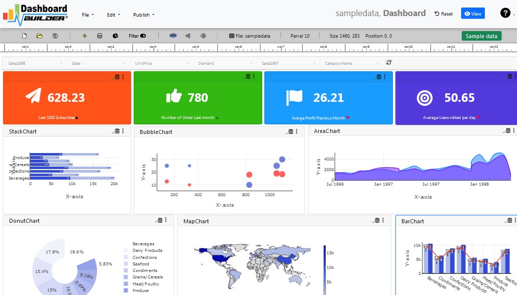
Top 5 Chart Types for Effective Data Storytelling
Data storytelling is a powerful way to convey insights and drive decisions through visuals. Among the various tools available, charts stand out as effective means to present complex data succinctly. Here are the Top 5 Chart Types that can enhance your data storytelling:
- Bar Chart: Ideal for comparing quantities across different categories, bar charts provide straightforward visual comparisons.
- Line Chart: Perfect for showing trends over time, line charts allow readers to easily track changes and patterns.
- Pie Chart: Best for illustrating proportions, pie charts make it simple to visualize how parts contribute to a whole.
- Scatter Plot: Excellent for showing relationships between two variables, scatter plots are vital for uncovering correlations in data.
- Heat Map: Effective for visualizing data density, heat maps allow viewers to quickly grasp areas of high and low activity.
How to Choose the Right Chart for Your Data Needs
Choosing the right chart for your data needs is essential for effective communication and analysis. Different types of charts serve different purposes, and selecting the appropriate one can significantly enhance the clarity of your message. Begin by considering the nature of your data: Are you looking to compare categories or show trends over time? For comparison, bar charts and column charts are effective, while line charts are ideal for depicting trends. It's also important to consider the audience; a more technical audience may appreciate complex visualizations like scatter plots, while a general audience may favor simpler visuals.
Another crucial factor to consider is the number of data points you have. When working with large datasets, a heatmap or a bubble chart can effectively visualize relationships and distributions without overwhelming your viewers. Conversely, if you have limited data, a simple pie chart can quickly convey proportions. In summary, always align your chart choice with your data's story and your audience's needs. A clear, well-chosen chart can transform complex data into compelling narratives, making your analysis more impactful.